
It’s no secret that most people look up restaurants, stores, and various services online using their phones. Imagine what would happen if they visited a website on their phone and the text appeared all wrong, with nothing aligned properly. They wouldn’t be able to read the content, navigate the website, or even buy anything from there. Now, can you see how crucial mobile-friendliness is in web development?
Let’s look at some key statistics:
- Mobile devices are responsible for generating over 60% of website traffic.
- The average bounce rate for websites that are not mobile-friendly is 60%.
- About 68% of mobile users are more engaged with websites that are mobile-friendly.
Think about this: When was the last time you used your phone to search for something? All the time, right? Mobile browsing has become king everywhere, and Glendale is no exception.
Let’s speak about mobile-friendly web development for Glendale businesses.
Why Go Mobile-Friendly in Glendale?
We cannot overlook the importance of web development for business success but why should it be mobile-friendly?
Imagine having to zoom in and out to view various things while attempting to read a menu on a small screen. Annoying, huh? That is the significance of having a mobile-friendly website. It all comes down to making your website mobile-friendly.
- More Visitors: Most individuals use their phones to research topics. More visitors are likely to visit your website if it is user-friendly on mobile devices.
- Improved on Google: Mobile-friendly websites are given preference by Google and are shown higher in search results.
- Happy Customers: People are happier and more likely to visit your business or make a purchase from you when they can quickly explore your website on their phones.
Having a mobile-friendly website may improve your Glendale local search rating and make it simpler for prospective clients to locate you online.
Mobile-friendly Web Development Strategies to Reach a Wider Audience
The following are practical methods for creating mobile-friendly websites that may help to expand your audience:
- Use Responsive Design First
The foundation of developing mobile-friendly websites is responsive design. It guarantees that your website will function flawlessly on all screen sizes, providing an excellent user experience on desktop, tablet, and smartphone devices. This strategy improves user engagement and increases the SEO performance of your website.
A good example of responsive design is the website for Apple. When using a MacBook, iPad, or iPhone, it seamlessly adapts to all screen sizes, guaranteeing that customers get a consistent experience.
- Optimize for Touch
Since touch inputs are used on most mobile devices, it is crucial to optimize your website for touch inputs. This involves leaving enough space to prevent accidental tapping and making interactive components, such as buttons and links, simple to tap.
- Prioritize Loading Speed
Websites must load quickly and be responsive for mobile users. Load times may be greatly decreased by using speed optimization strategies like image compression, caching, and reducing CSS and JavaScript. Pages that load quickly increase user engagement, lower bounce rates, and improve your site’s exposure in search engine results.
For example, Google’s emphasis on speed is shown via the AMP (Accelerated Mobile Pages) initiative. AMP-enabled websites load very instantaneously and provide the best possible user experience. By cutting down on wait times, this strategy aids in user retention—a critical component in sustaining high levels of engagement.

- Simplify Navigation
The key for mobile users is simplicity. Provide a simple, intuitive navigation menu on your website so that people can quickly and easily locate what they’re searching for. Consider using easily navigable menus, sizable buttons, and a search feature that is simple to use on smaller displays.

- Consider Clear Content
Besides visuals, content is what makes people stay at your website. Strong content is essential as people understand how to purchase or what features your services have through storytelling. This means creating interesting content for mobile platforms first, then optimizing it for bigger displays. To make material simpler to read on tiny devices, keep it brief and to the point. You may do this by using headers, bullets, and graphics to break up text.
- Implement Local SEO Strategies
Local SEO tactics are crucial for Glendale companies that want to reach a local audience. This entails making sure your company is included in local directories, including location-based services like maps, and optimizing for local search phrases. Local SEO increases your exposure to a specific audience, improving the visibility of your local company as well as your online presence.
For example, Yelp is a great resource for local SEO, facilitating consumers’ search for local businesses, services, and eateries. To increase exposure, their mobile site makes use of local keywords and makes sure that their listings are suited for local searches.
- Test Across Different Devices
Having device compatibility is essential to reaching a wider audience. Test your website often across a range of browsers and devices to make sure it functions properly everywhere. This cross-platform compatibility guarantees your audience a consistent and engaging experience on any device.
- Focus on Accessibility
Website accessibility is crucial, not just for inclusivity but also for reaching a broader audience. Ensure your website is navigable for everyone, including those with disabilities. This includes readable fonts, alt text for images, and voice command compatibility.
- Engage with Interactive Elements
Incorporate mobile-optimized interactive components to boost audience engagement. Touch-sensitive sliders, interactive surveys, and user-friendly forms are a few examples of this. It is important to design these components with mobile users in mind to make sure they are not only functional but also interesting on smaller displays.
Adopt Mobile-First Approach with Digilite
Now you know how to adopt a mobile-first approach. This approach prioritizes the mobile experience, ensuring that applications are optimized for smaller screens, touch interactions, and on-the-go accessibility.
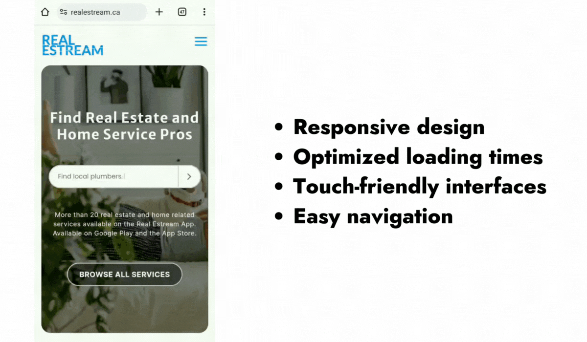
For the RealEstream project, our focus was to create an application that brings real estate streaming services to users’ fingertips. Collaborating with the RealEstream team, we aimed to design an intuitive, user-friendly platform that allows for seamless navigation on mobile devices. This project exemplifies the application of mobile-friendly web development strategies, emphasizing responsive design, optimized loading times, and touch-friendly interfaces.
Mobile Tips from Digilite to Glendale-Based Businesses
Here’s what Glendale customers crave on mobile:
- Local Focus: Sprinkle relevant keywords like “Glendale [your service],” “Best [your service] in Glendale,” or “[Your service] near me” throughout your website content.
- Local Listings: Add correct information, images, and favorable reviews to your Google My Business listing after claiming it.
- Quick & Simple: Make sure the mobile version of your website loads promptly. Make sure your images are optimized, and choose a trustworthy web server.
- Easy Navigation: Avoid confusing your audience! Make menus simple to navigate so that consumers can quickly discover what they need. Consider large, tactile buttons for important functions.
- Mobile-Friendly Content: Emphasize exclusive deals or services that are relevant to Glendale. Showcase positive reviews from satisfied Glendale customers.
Want to take that burden off your shoulders? We are here to lighten the load.